Creating Layer No. 2
Now, click on the graph with the right mouse button. From the pop-up menu, choose "Layer --> New Layer --> 2D".
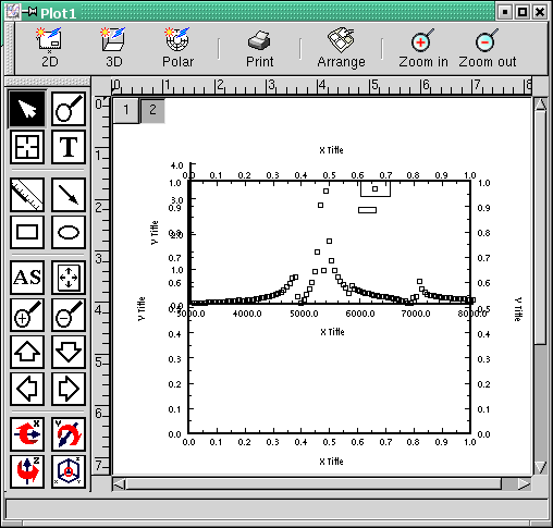
Firstly, you will notice that there is a new plot template on the plot page (Figure 3-6). Also, you will notice that there is a new grey button "2" in addition to the button "1". These two buttons represent the layers on which each of the two graphs is plotted.
For those who are not familiar with the layer concept: a layer is like a transparency on which a single graph is plotted. If you have, e.g., two graphs, each on its own transparency, you can visualize a combined graph by laying transparency 2 on top of transparency 1. You will then see both graphs simultaneously.
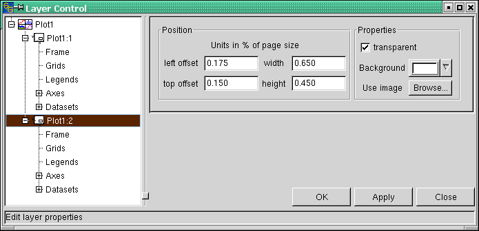
We will now align the graph in layer 2 such that its position and size are identical with the layer 1 graph. To do so, we open the Layer Control dialog again (e.g. by double-clicking the "2" button). First, notice the change in the tree structure. Layer number two is represented by a branch of its own, denoted "Plot1:2". The ":2" stands for layer two. If you now expand the branches of layers 1 and 2, you see that their structure is identical (see Figure 3-7).
Now, copy the position data that have been entered into the "Plot:1" dialog shown in Figure 3-2 to layer two (this is done using the "Plot:2" dialog shown in Figure 3-7). If you now click the "Apply" button, the two graphs have exactly the same position and size. Only the scaling of the left and the bottom axis looks a bit strange.
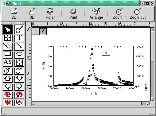
We fix this by activating the "Axes" dialog of layer 2. Here, we uncheck the "Axis", "Ticks labels" and "Titles" checkboxes for the bottom x axis as well as for the left y axis (cf. Figures 3-3 and 3-4). The axis scaling is set from 3000 to 8000, "Major Ticks" 1000, "# minor ticks" 4 (same as for layer 1 - see Figures 3-3 and 3-4). We also uncheck "Ticks labels" and "Titles" for the top x axis, because the x axis scaling is the same as for the bottom axis of the layer 1 graph.
For the right y axis, we set the scaling from 0 to 4000, "Major Ticks" 1000, "# minor ticks" 1. Now, click the "Datasets" entry for layer 2 in the dialog tree. Add the "AccelTop" dataset of the "spectrum.dat" worksheet to the layer 2 graph.
If you have not forgotten to click the "Apply" button every time you changed the entries of a dialog, your graph should now look like in Figure 3-8. This result is still somewhat ugly because both datasets use the same symbol so that they are hard to distinguish from one another.
A better idea would be to represent the two datasets with lines of different color. And as the legends coincide, it would be advisable to drag one of them to a different position. But first line and color...


