Amplitude and acceleration in one diagram?
The idea how to plot amplitude and acceleration into one diagram is to combine the graph of two layers which then appear as one diagram. We will do this by creating two graphs with identical position and size.
First, we create a graph which just contains the "AmplitTop" data. We double-click the "Plot1" icon in the "Plots" canvas of the SciGraphica main window. The graph page containing a plot template opens. By double-clicking the "1" button in the upper left corner of the plot page, the "Layer Control" dialog opens. As we have explored this dialog in full detail in tutorial 2, we will now only touch those items that are of concern for our present task.
Again, it is advisable to place the graph window to the upper right corner of the screen and the "Layer Control" dialog to the upper left corner.
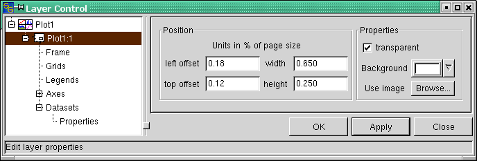
Click the "Plot1:1" entry in the dialog tree on the left. Into the "Position" frame, input the numbers as shown in Figure 3-2. Now click on the "Datasets" entry in the dialog tree. Add the "Frequency" column as the x column and the "AmplitTop" column as the y column. If you are not sure how to do that, please refer to tutorial 1, thereof Figures 3-3 and 3-4.
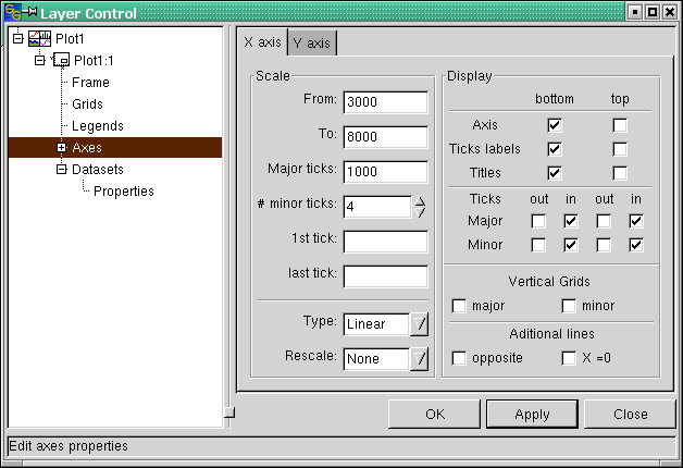
Next, choose the "Axes" dialog to input the axis scaling. The settings can be taken from Figures 3-3 and 3-4. Clicking the "Apply" button shows the measured frequency response. At the moment, the data are visualized as a scattered graph which looks rather ugly - we will deal with that later. For the moment, we will focus on the display settings.
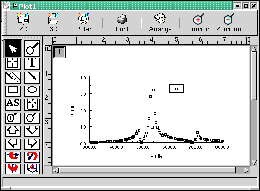
As you can see from Figures 3-3 and 3-4, the "Axis", "Ticks labels" and "Titles" checkboxes for the top x as well as for the right y axis have been set to unchecked. This is because we want to use only the bottom x and the left y axis for representation of the amplitude data. If you make your settings accordingly and click the "Apply" button, your graph should now look like that in Figure 3-5.


