Chapter 3. Plotting My Data
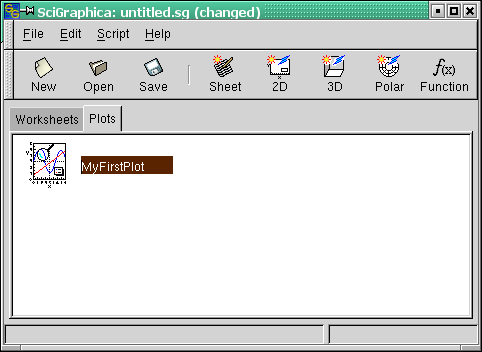
After having input the data into the worksheet "MyData", the next step is to activate the "Plots" canvas in the main window by clicking the "Plots" tab. To create your first plot, just click the "2D" button in the button bar (Figure 3-1). Do not worry that you have only created an icon. First of all, rename the highlighted name of the plot icon - by default named "Plot1" - into "MyFirstPlot".
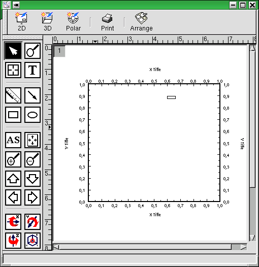
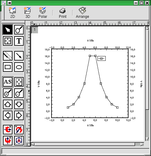
Now double-click the plot icon. A plot window named "MyFirstPlot" opens (Figure 3-2). Just ignore the button bar on top of the window as well as the toolbar on the left hand - we will return to that later. Instead your attention should be caught by the small, grey button of a square shape at the upper left corner of the graph page. The button shows just a number "1". The meaning of this number will be explained in detail in tutorial 3.
At the moment, the plot does not seem to have anything to do with the worksheet data you typed in. To change this, double-click the small, grey button named "1" in the upper left.
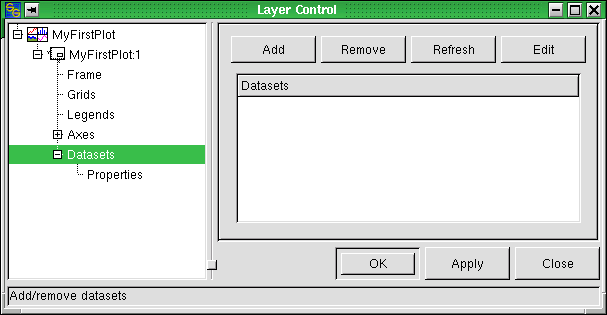
Having double-clicked the small button in the upper left corner of the graph page, the "Layer Control" dialog shown in Figure 3-3 opens.
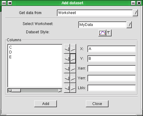
The dialog is divided in two parts. The left hand part shows a tree view of the graph's structure. We will examine this in full detail in tutorial 2. For the moment, we just click the Add button in the right hand part of the dialog. A new dialog - named "Add dataset" - opens (Figure 3-4).
The "Get data from" dropdown list shows the item "Worksheet", the "Select Worksheet" contains "MyData" - so there is nothing to change for us at the moment. The dropdown list "Dataset Style" lets you choose the style in which your data will be plotted. As we want to change this, we click the down arrow on the right of the style symbol and choose the line + symbol style as shown in Figure 3-4. Next, by clicking we highlight the "A" entry in the "Columns" box and click the arrow button pointing towards the "X" textbox. The "A" entry will now appear in the "X" textbox, whereas it has disappeared in the "Columns" box. We repeat the procedure for the "B" entry in the "Columns" box which is moved to the "Y" textbox. Clicking the "Add" button, we leave the "Add dataset" dialog and return to the "Datasets" section of the "Layer Control" dialog. Clicking the "Apply" button, the data of the "MyData" worksheet are added to the graph.
But what's that? There are no data visible in "MyFirstPlot"! Do not worry - we will fix this right away.
Taking a look at the graph's x and y axis scaling, there is a discrepancy between the range of values that we have typed into our "MyData" worksheet and the default scaling of the graph layout. To fix this, just click the "AS" button in the toolbar (see Figure 3-5).
Congratulations! You have plotted your first set of data using SciGraphica.
In tutorial 2, all the details of formatting MyFirstPlot will be shown. Therefore, you should save your first SciGraphica project. To do so, click the "Save" button. Type tutorial1.sg in the File textbox of the Save Project dialog.
